Edge Delta Pattern Widget
4 minute read
Overview
You can filter the contents of a Pattern Widget using the filters pane, similarly to filtering on the Patterns tab. This includes filtering by Custom Facets you have configured already, and by variables present on your dashboard.
Data Options
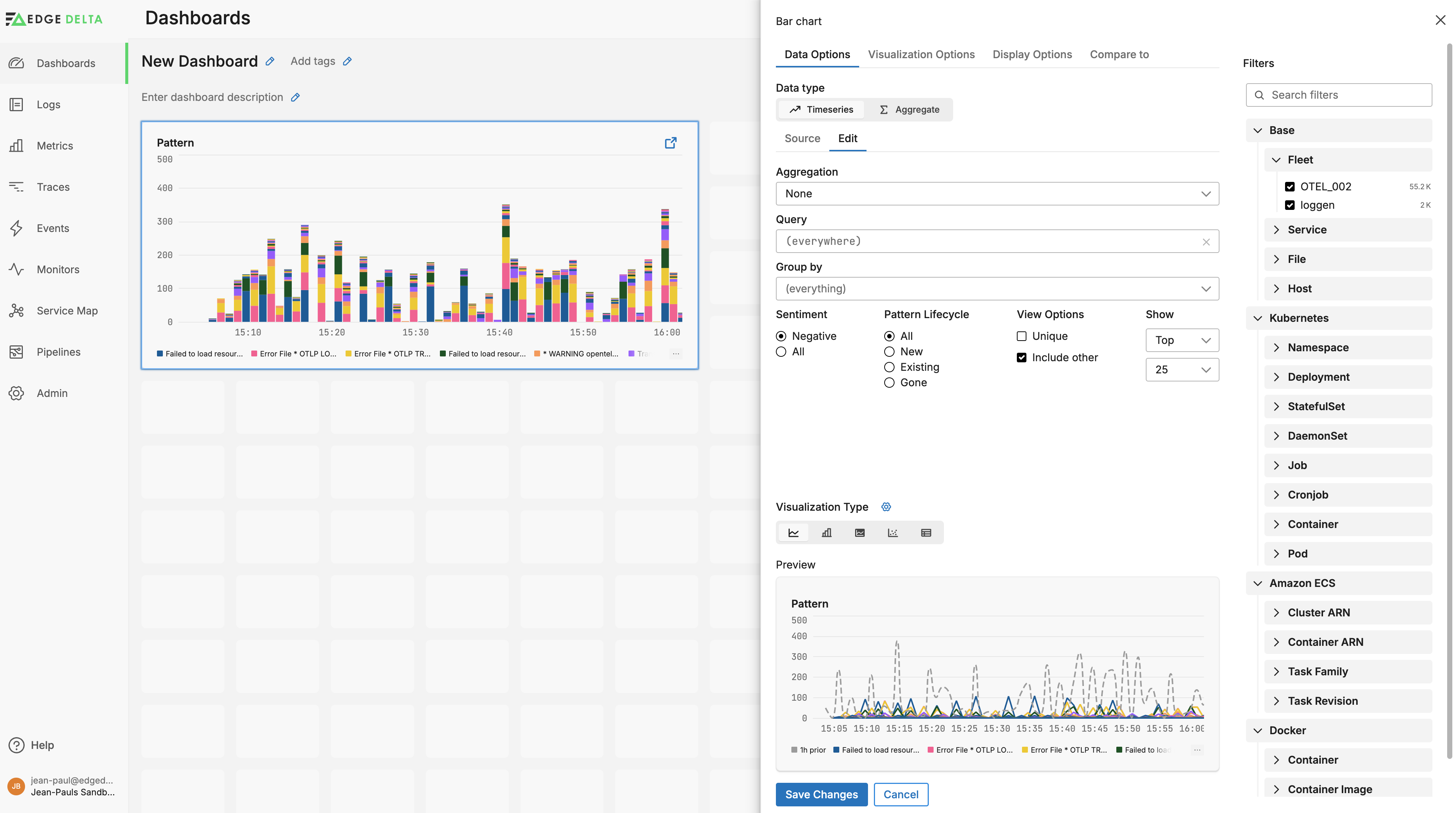
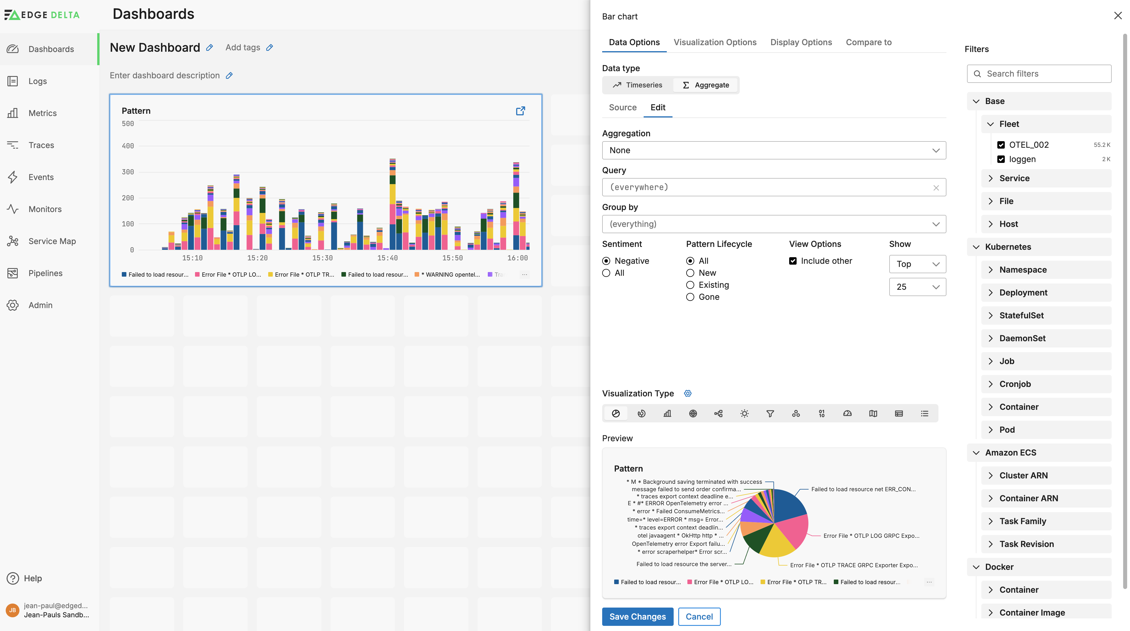
In the Data Options tab,you can choose the incoming data type: time-series graph or aggregation. As you select each option the appropriate visualization type is selected and the preview is updated.
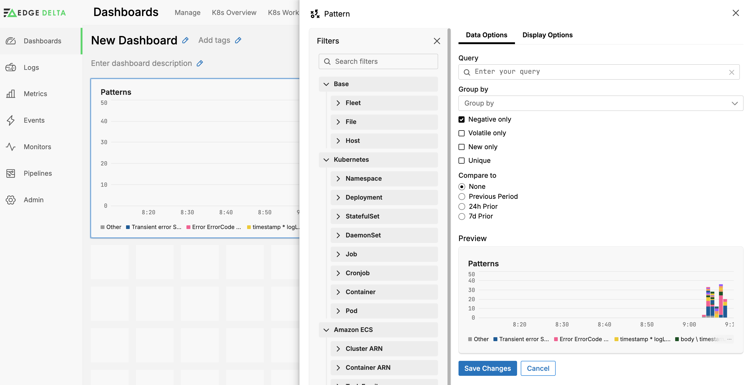
On the Edit sub-tab, you can configure pattern options:
- Query: specify a pattern search query or reference a query or string variable.
- Group By: You can group the patterns by available facets including Custom Facets, and you can select a facet variable to group by dynamically depending on the dashboard user’s selection.
- Select the types of patterns to view, such as only negative sentiment patterns.
- Select the pattern lifecycle such as only newly detected patterns.
- Select how many patterns to include in the widget from the top or bottom of the patterns table.
- Visualization Type: you can choose to render the data as a line chart, bar chart, area chart, scatter plot, or table.
Visualization Options
Click Visualization Options to configure how data is presented. For example you can specify whether to show the Legend, the data format of the x-axis, and custom colors per data series.
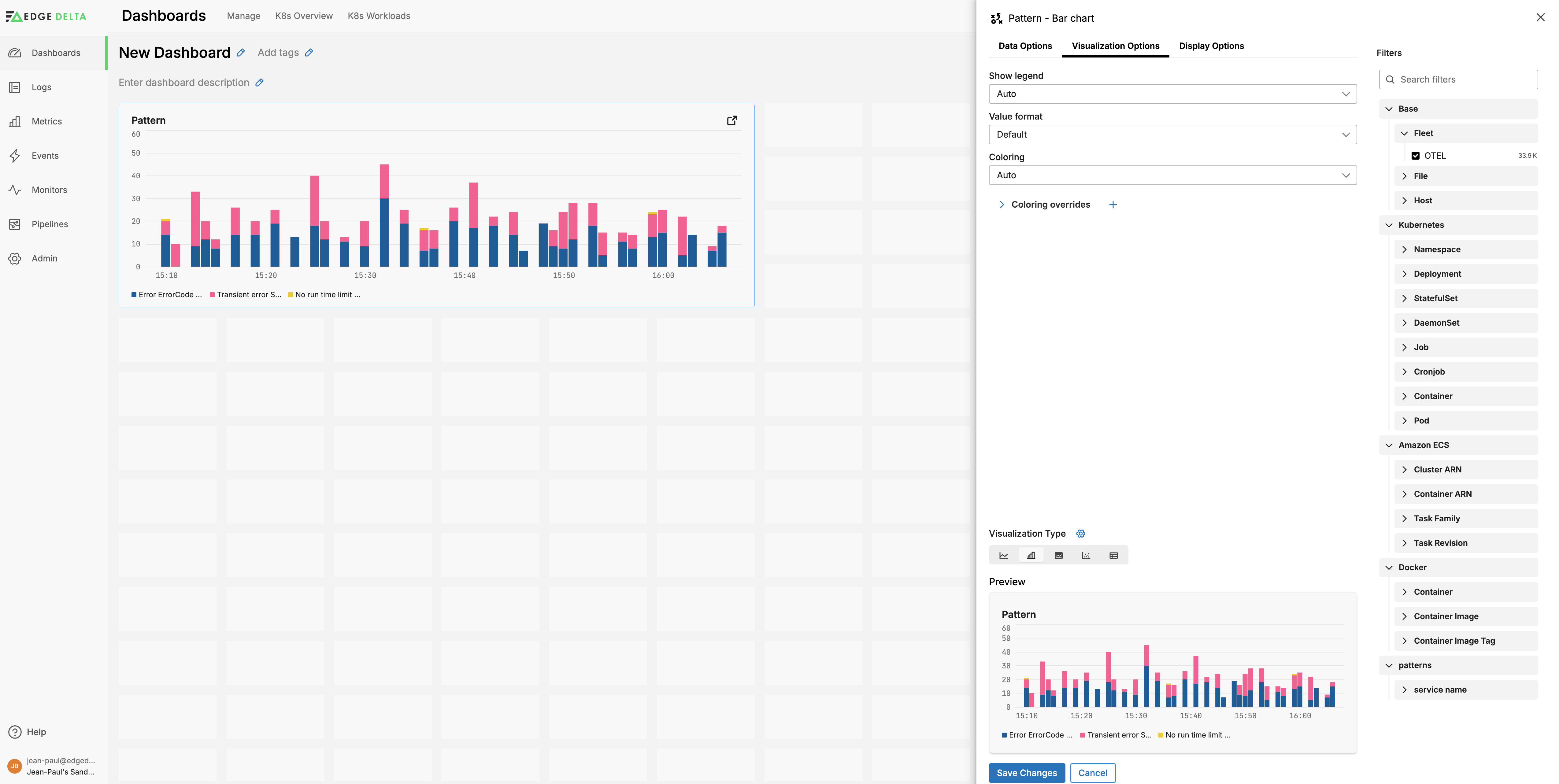
Add Series Colors
On the Visualization Options tab, you can specify colors for the graphs using the Coloring method options:
- Auto: This option chooses a palette depending on the widget type. For timeseries and some aggregate charts the Default palette is used.
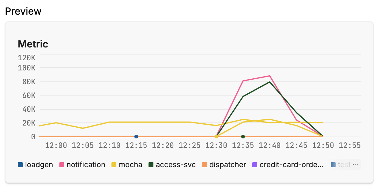
- Default palette: This option uses the built-in Edge Delta color palette that is designed for readability and to work with the interface colors.
- Random palette: This option uses randomly selected colors for each series.

- Custom palette: You can use this option to choose a set of colors which are assigned sequentially to the series, to specify your own colors for particular a series you can use Coloring overrides that follow.
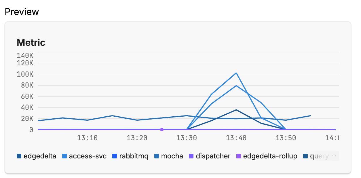
- Continuous color mapping: This option changes series colors on a gradient depending on a x-axis value. You set the value range and colors. This is useful for visualizing gauges and indicating a threshold.
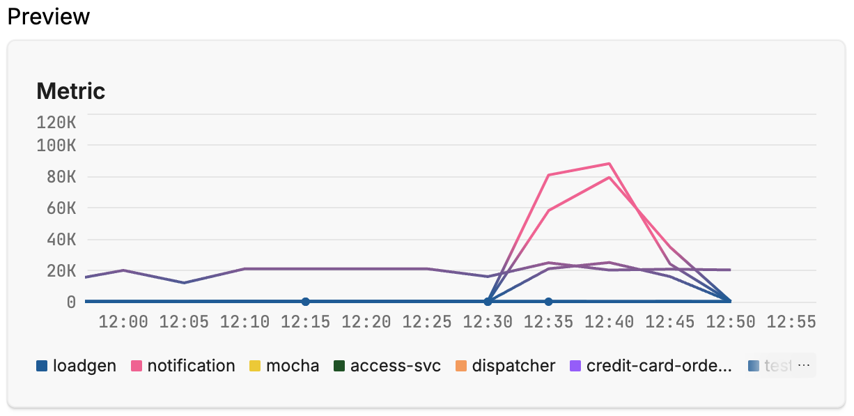
- Discrete color mapping: This option is similar to Continuous but you set intervals and colors for each interval. The colors do not change in a gradient but rather switch as the series passes the interval.

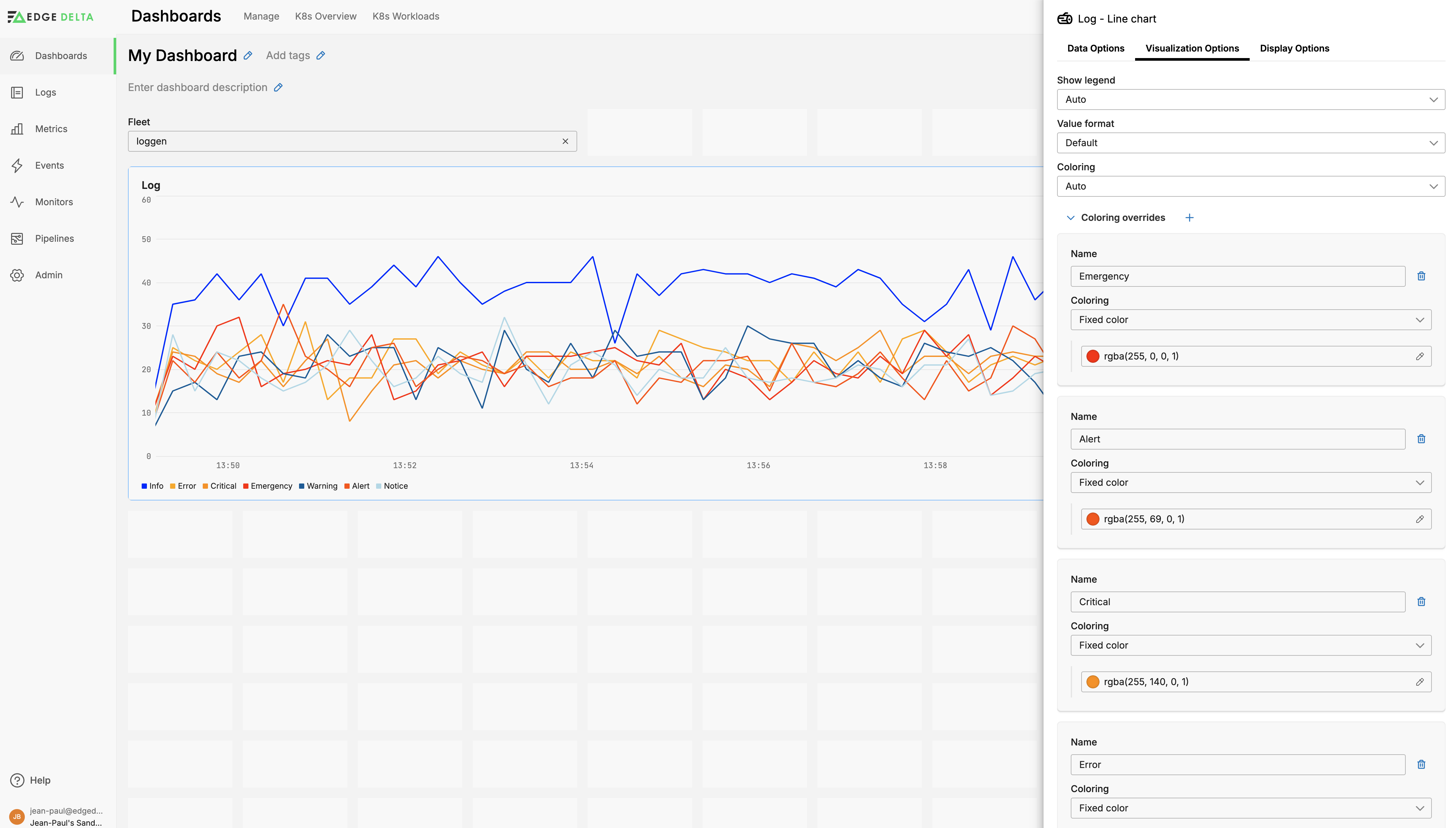
Rather than using preset templates you can configure specific colors for specific series in the charts. For example, you can color-code severity levels on a gradient with the highest severity being hot red and the lowest being cool blue.
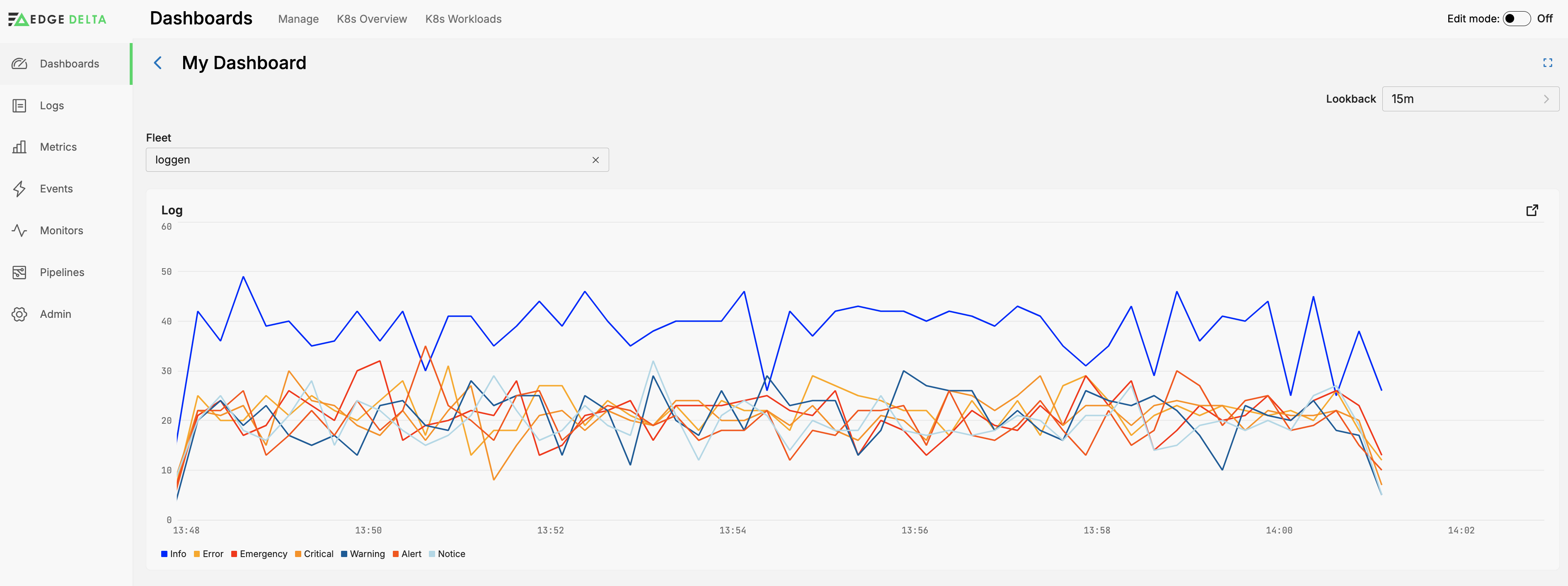
To do this, open a widget in Edit Mode and click the Visualization Options tab. Expand the Coloring overrides section and create a new item for each series, then specify a Fixed color:
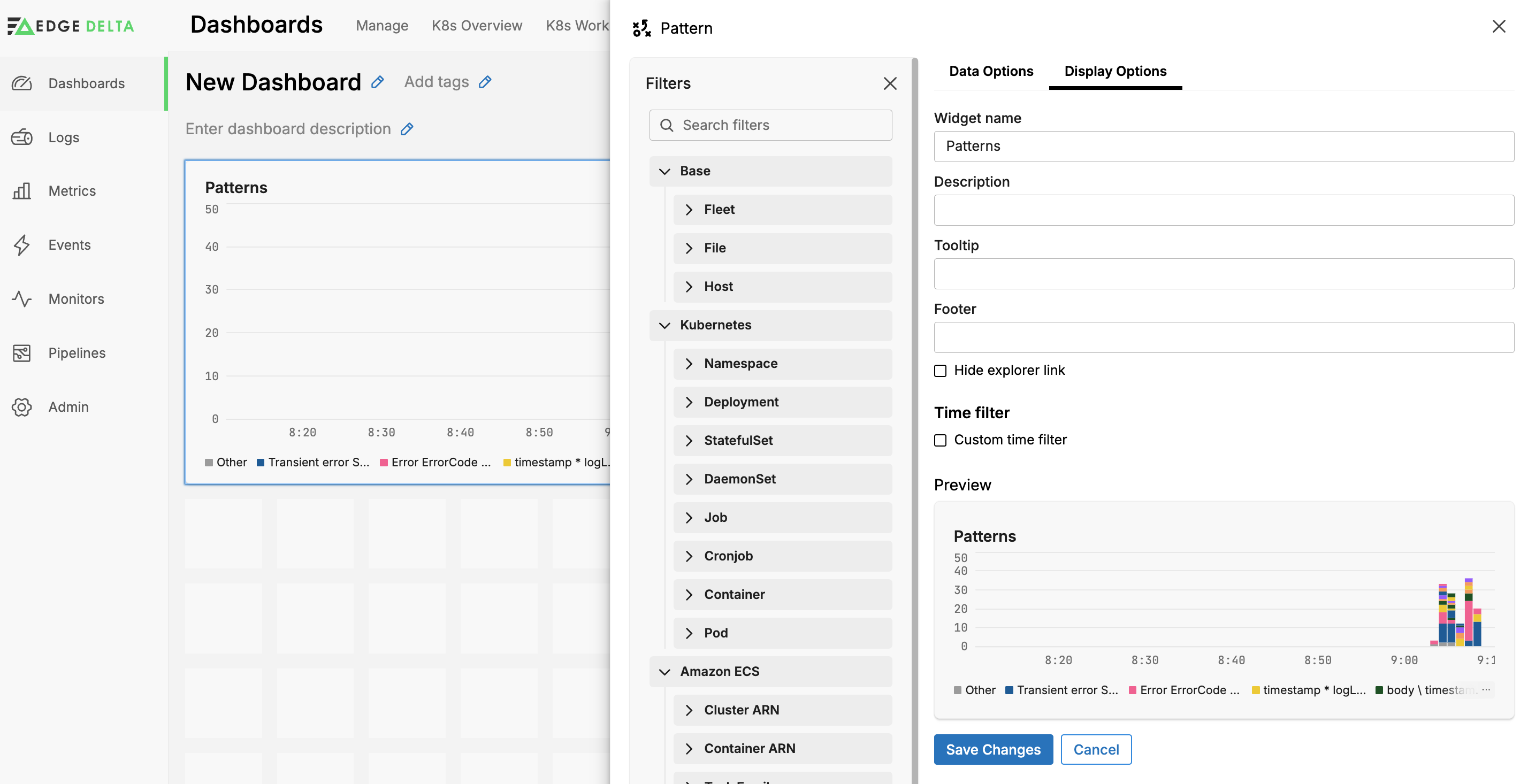
Display Options
Click Display Options to configure the widget labels. You can set the Time Filter to either inherit from the parent dashboard, or you can set a custom look back period. You can also hide the explorer link.
Compare to
Click Compare to to add another series to the graph showing historical data. You can choose a specific period or choose Previous Period to have it dynamically determined by the Look back setting of the dashboard.

Visualization Type
The Visualization types change the way in which the data is rendered. The types depend on your other selected Data Type on the Data Options tab.
For a Timeseries data type you can view data as a
- Line Chart
- Bar Chart
- Area Chart
- Scatter Plot, or
- Table.
For an Aggregate data type you can view data as a
- Pie Chart
- Donut Chart
- Column Chart
- Radar Chart
- Treemap
- Sunburst Chart
- Sankey Chart
- Bubble Chart
- Big Number
- Gauge
- Geographical Map
- Table
- List
Geographic Map
You can configure the widget to show a map with indicators of the locations extracted from data items. To do this, you must select the Aggregate data type and the Geographical Map Visualization type. You specify a facet in the group by field that contains a single code of one of the following types:
- IATA 3-letter airport code (SEA)
- ICAO 4-letter airport code (KSEA)
- ISO_3166 2-letter country code (US)
IATA codes are interpreted first and may clash with 3 letter ISO_3166 codes. Therefore IATA or 2 letter codes are recommended.
See Visualizing Maps for more information about how to configure a pipeline to extract this information.