Edge Delta Aggregation Metric Widget
3 minute read
Overview
After selecting a type, the options open in the Filter pane. In this example, Metric is selected.
You can select resource filters such as the pipeline name, namespace etc. This includes filtering by Custom Facets you have configured already, and by variables present on your dashboard or in the toolbox.
Data Sources
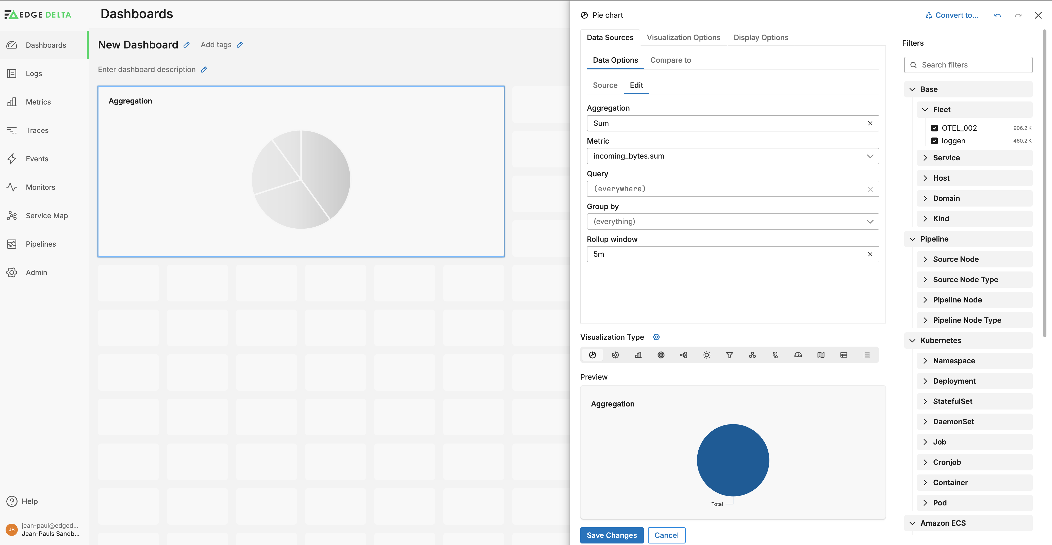
Next, you configure the source options. You can do this on the Edit tab or the Source tab. The Edit tab enables you to manually select filters, while the Source tab enables you to paste a search query, for example one copied from the Metric Explorer. As you select options on the Edit tab, a query is built on the Source tab.
On the edit tab, you can select the following filters
- Aggregation: specify how data is calculated and summarized for each rollup period. See the aggregation options.
- Metric: Select a particular metric to view.
- Query: Use autocomplete to select a resource filter for the metric. For the value you can specify a variable name. This makes the widget responsive to the options selected by a user viewing the dashboard, for example if they filter all widgets by a particular namespace.
- Group By: You can group the metric by available facets including Custom Facets, and you can select a facet variable to group by dynamically depending on the dashboard user’s selection.
- Rollup Window: This interval determines how regularly to apply the aggregation method and generate a data point on the graph.
You can add a second data source to visualize them both on the same widget. Click Add data source and select a data type to add to the current chart:
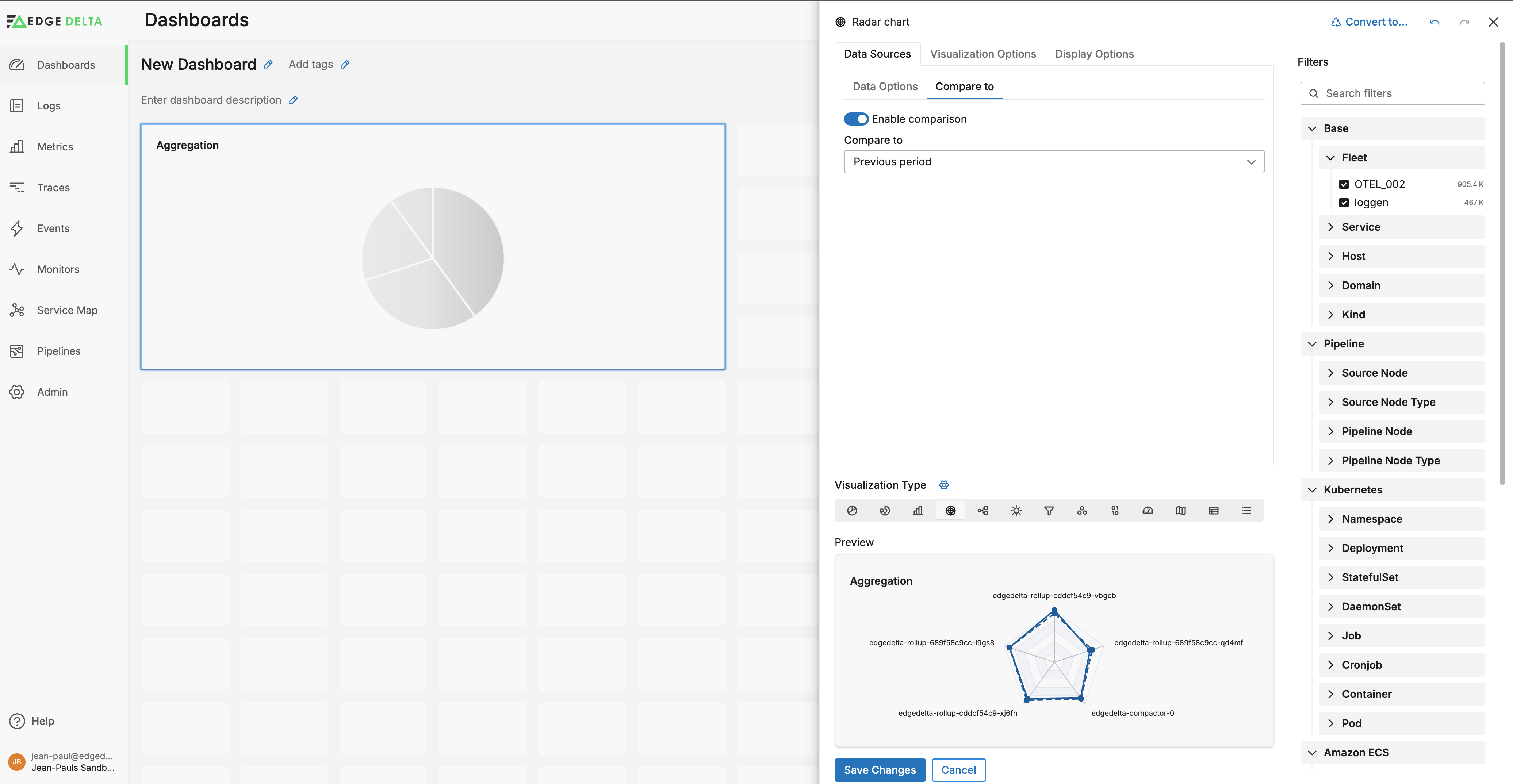
On the Compare to tab you can add a historical series for the selected data source. This series can show a particular look-back period or it can show the previous time range for currently selected look-back period:
Visualization Options
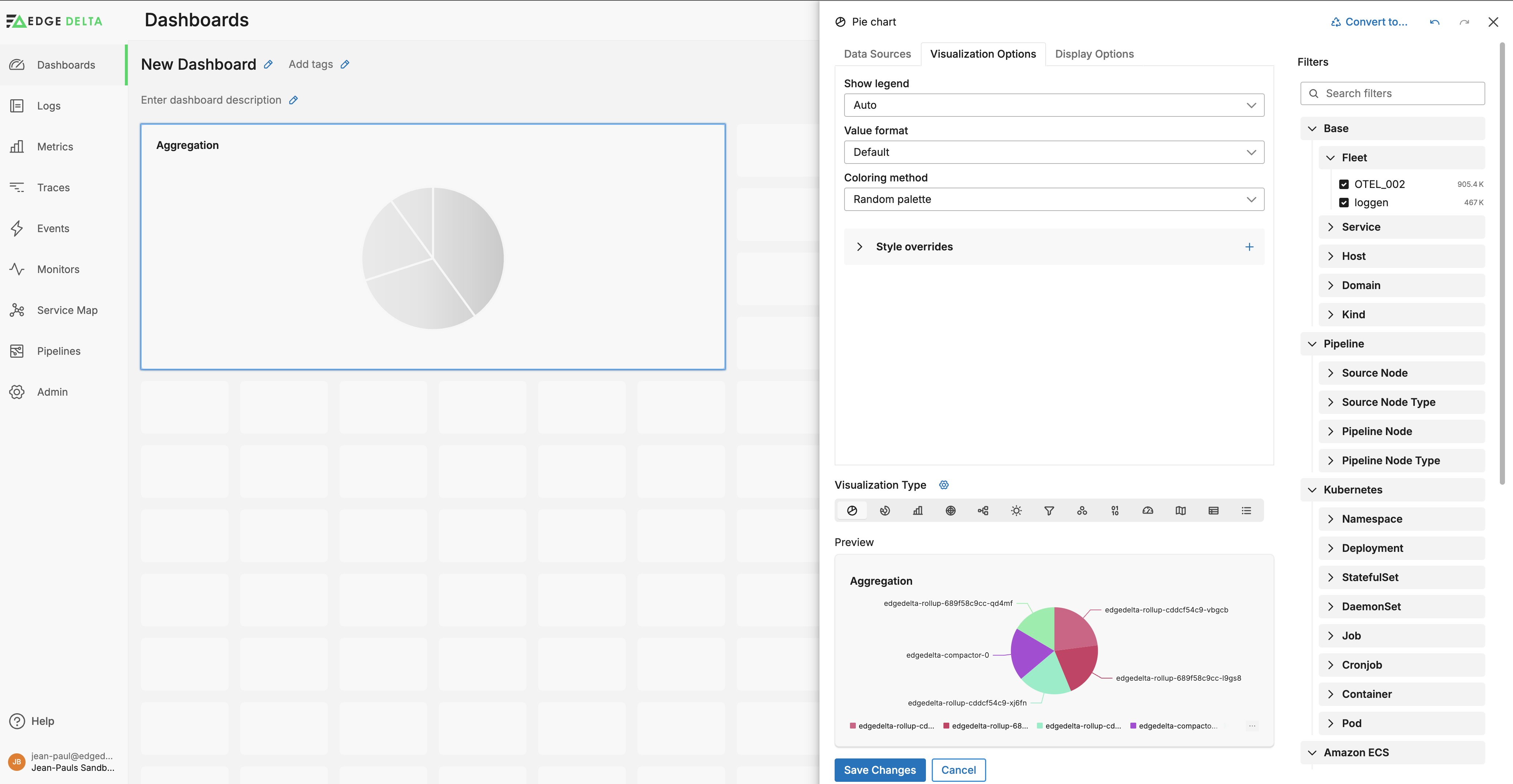
Click Visualization Options to configure how data is presented. For example you can specify whether to show the Legend, the data format of the series, and custom colors per data series.
Add Series Colors You can specify colors for the graphs using the Coloring method options:
- Auto: This option chooses a palette depending on the widget type.
- Default palette: This option uses the built-in Edge Delta color palette that is designed for readability and to work with the interface colors.
- Random palette: This option uses randomly selected colors for each series.
- Custom palette: You can use this option to choose a set of colors which are assigned sequentially to the series. Right click to remove a color.
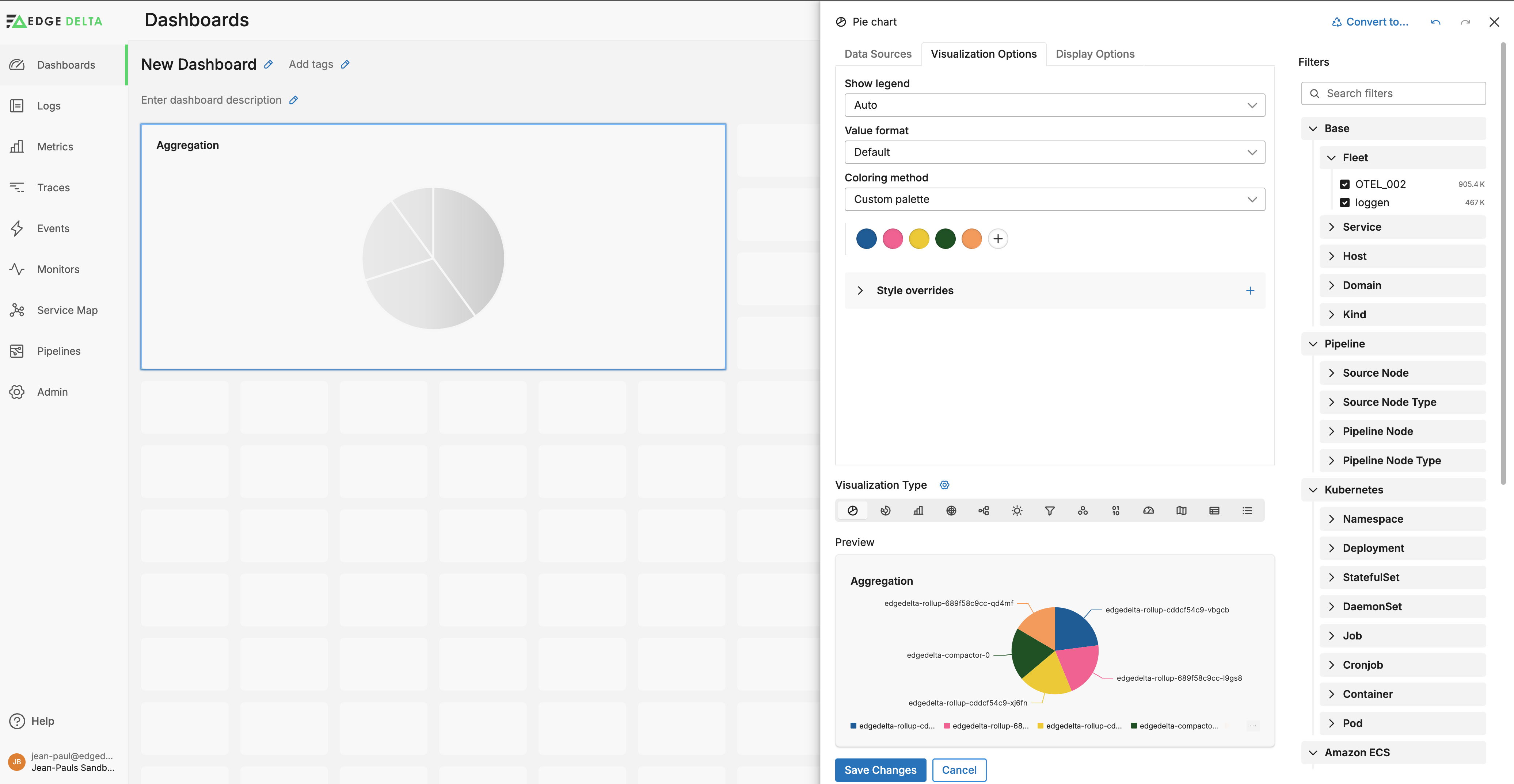
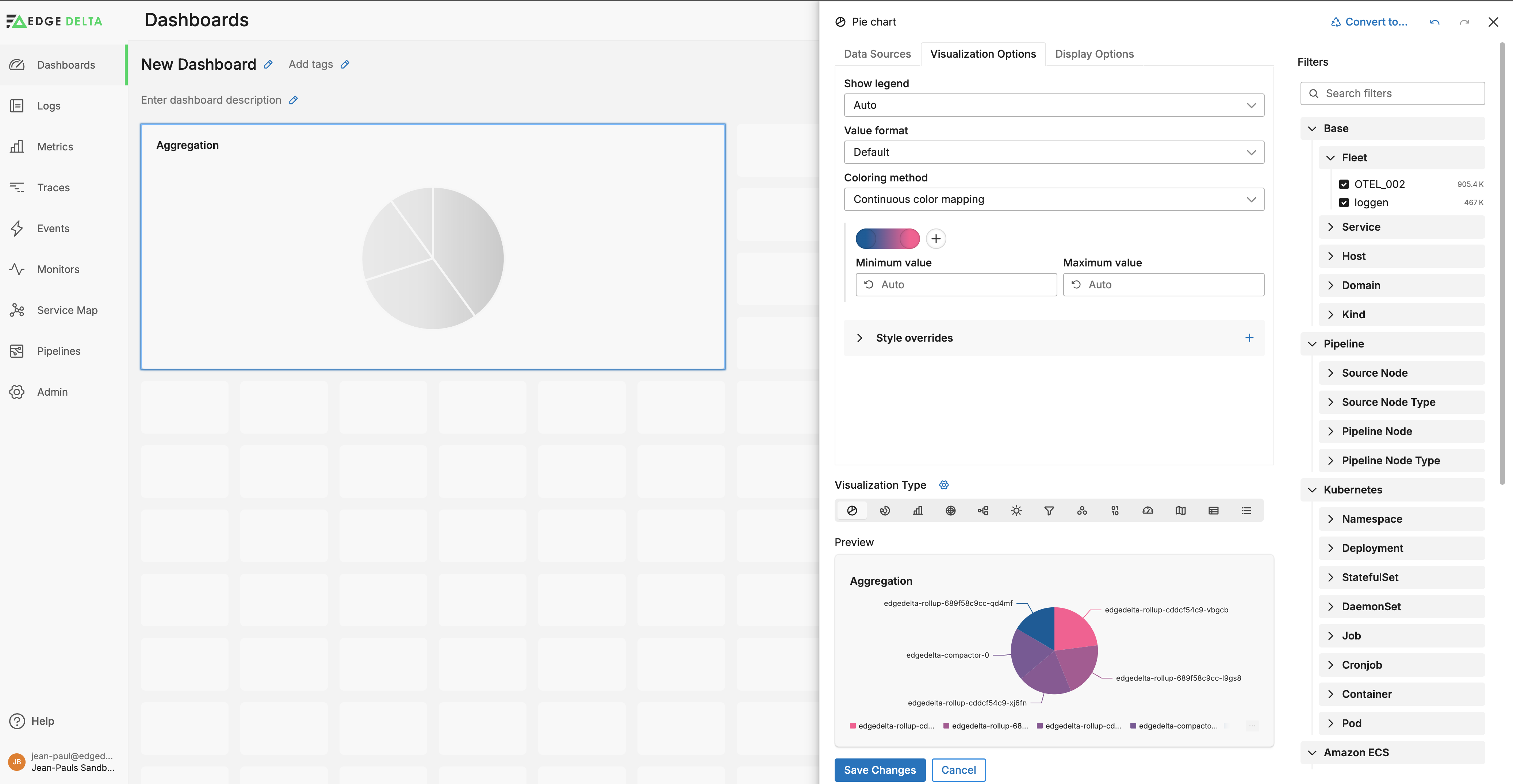
- Continuous color mapping: This option changes series colors on a gradient depending on its y-axis value. You set the value range and colors. This is useful for visualizing gauges and indicating a threshold.
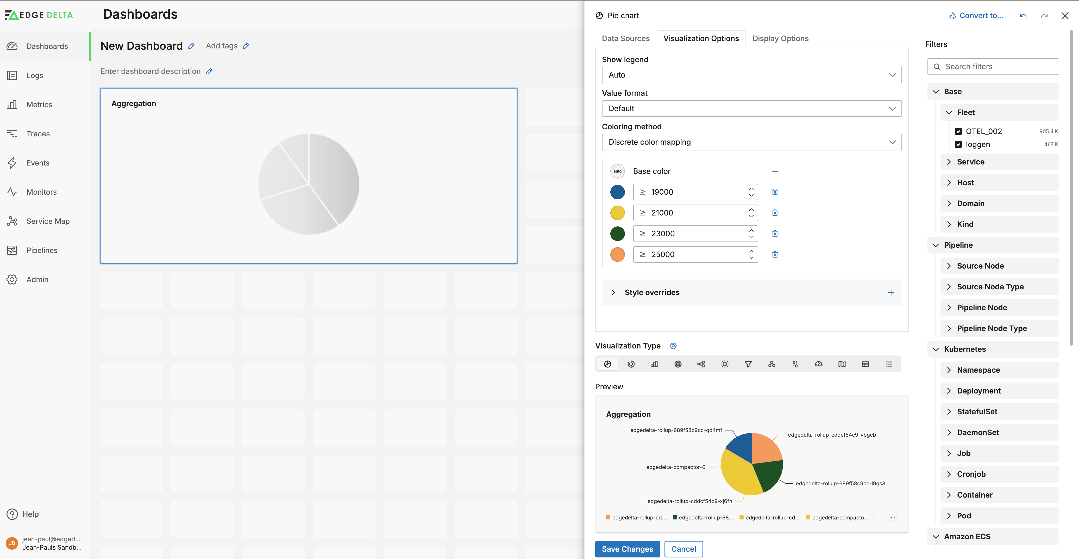
- Discrete color mapping: This option is similar to Continuous but you set intervals and colors for each interval. The colors do not change in a gradient but rather switch as the series passes the interval.
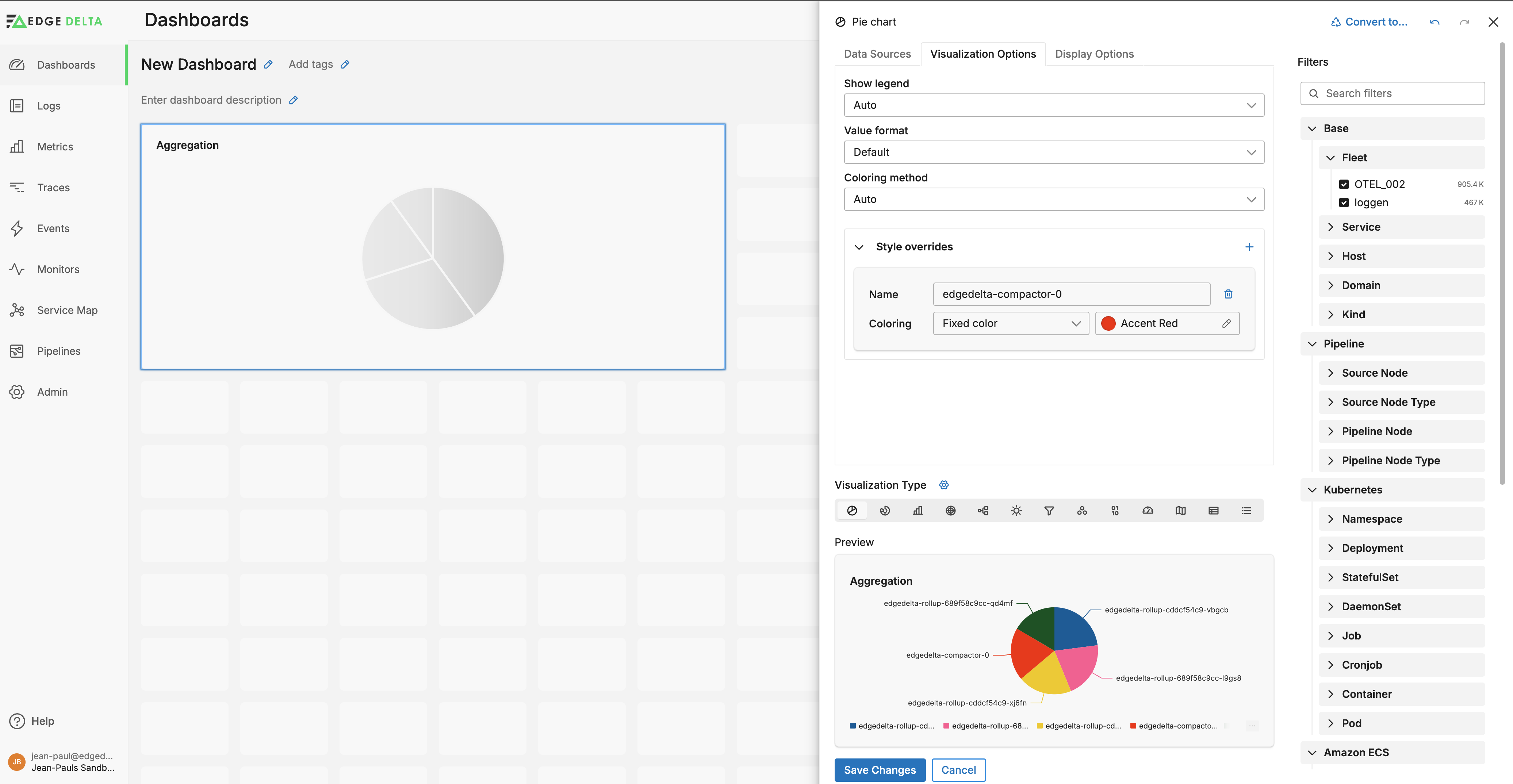
Rather than using preset templates you can configure specific colors for specific series in the charts. To do this expand the Style overrides section and create a new item for each series, then specify a Fixed color:
Display Options
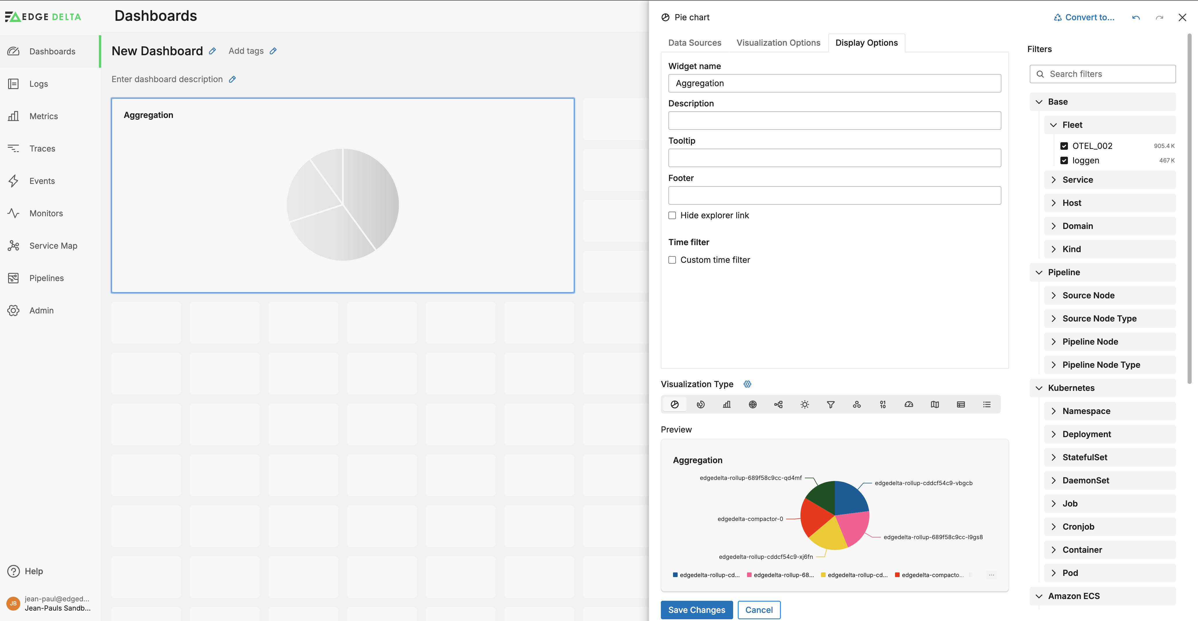
Click Display Options to configure the widget labels, a tooltip and footer text. You can set the Time Filter to either inherit from the parent dashboard, or you can set a custom lookback period.
