Edge Delta Metrics Explorer
5 minute read
Overview
The Metrics page displays the outputs and values of all metrics ingested and created by Edge Delta, including Kubernetes scraped metrics, metric processing nodes, metric source nodes, and derived metrics. Use the Source field to filter metrics using CQL syntax.
See Ingest Kubernetes Metrics.
Note: The types of metrics available in the Metrics window will depend on what Input sources you’ve configured for Metrics ingestion. For example, if you have deployed a Kubernetes Metrics Input Node in a particular Agent Tag configuration then you should see the Kubernetes metrics available in the Metric Name dropdown box, such as
ed_k8s_metric_container_network_receive_packets. For a complete list of Kubernetes metrics ingested by the Edge Delta agent, please the metrics list.
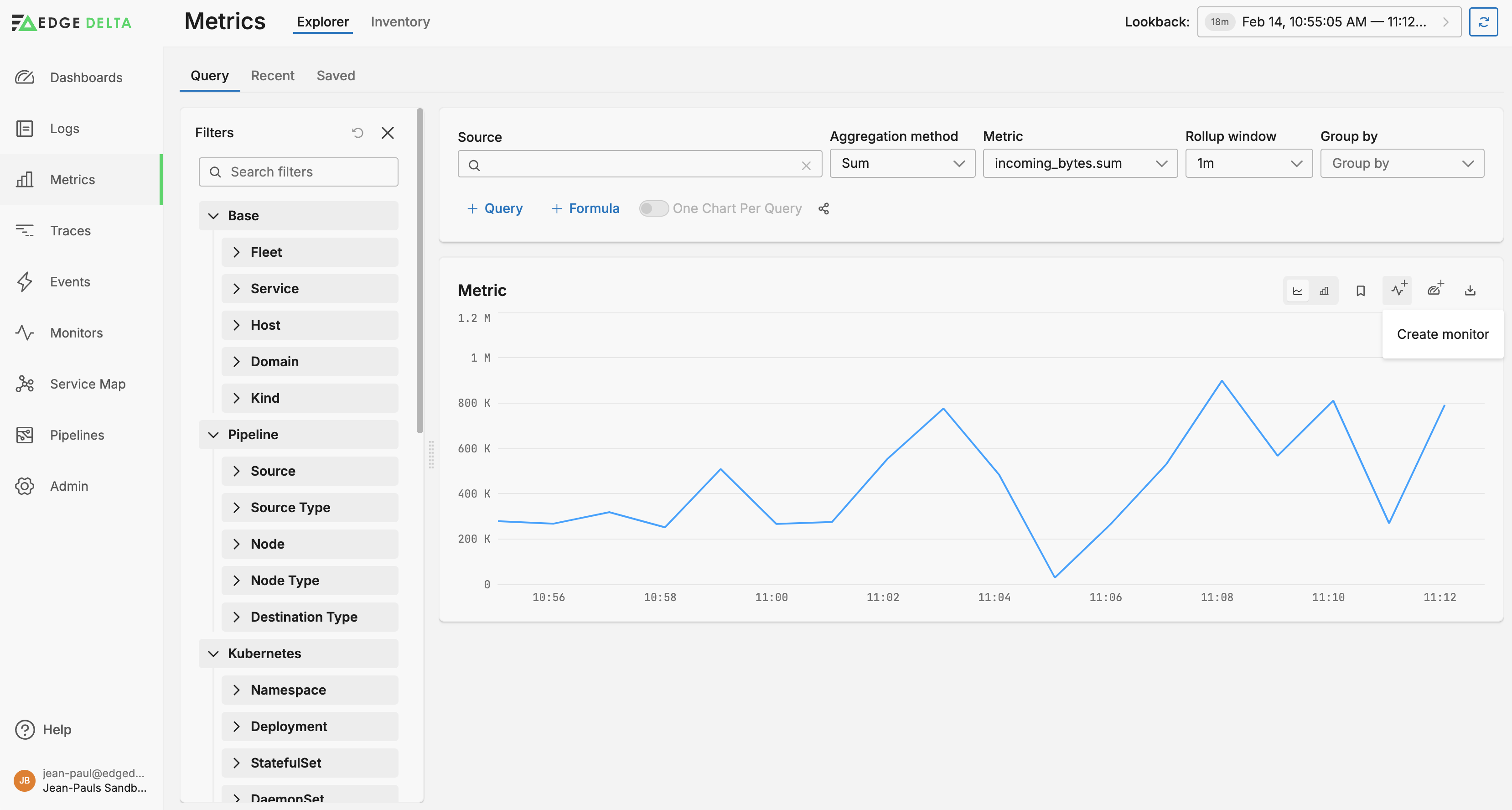
Metrics
Click Metrics to view the Metrics Explorer and select a metric.
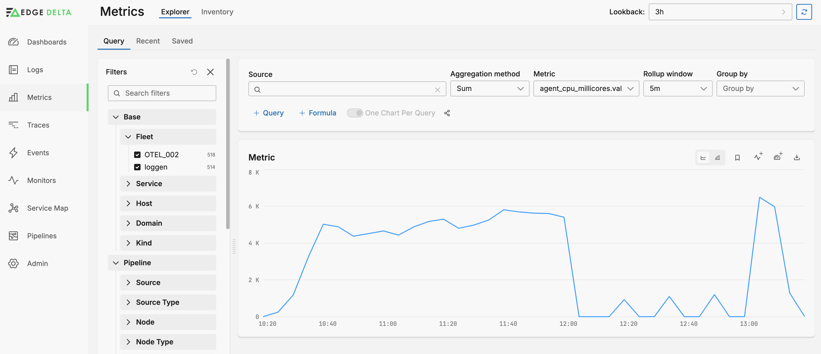
Aggregation transforms raw data into meaningful summaries by applying mathematical operations, which condenses many data points into a single, understandable figure:
- Sum: Adds up all data points over a defined period or set of records, useful for total measurements like total traffic volume.
- Average: Computes the mean value of data points, providing a general trend or typical measurement over a dataset.
- Min and Max: Identify the smallest or largest data point in the set, highlighting extremes, which can indicate unusual events or conditions.
- Count: Simply tallies the number of records or events, useful for quantifying occurrences like the number of error logs.
- Median: Finds the middle value in a sorted set of data, offering a robust measure of central tendency that is less affected by outliers.
- Count Unique: Counts distinct values in a dataset, important for identifying diversity or variety in records, like the number of unique hosts.
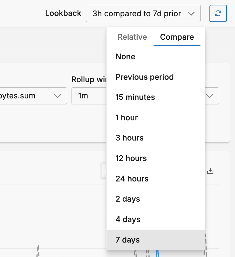
You can select the Lookback period and the comparison period. The comparison period takes the average of lookback intervals for the given period and this is rendered as a line in the graph:
Rollup
The rollup option determines the duration for which the Aggregation operation is executed. For example, suppose you select Average aggregation with a rollup period of 1 minute. If 120 metric data items are detected in one minute, their values are captured and their mean average is shown as a single data point, rather than 120 individual data points.
Bear in mind the relationship between the interval in the node and the x-axis interval (Roll up) in the Metrics Explorer. An interval of 3 minutes on the node with a 1 minute rollup on the explorer results in no data for two intervals in the explorer followed by an aggregation of the past three minutes. This may be suitable for most use cases, but you can make the rollup value equal to or larger than the interval to reduce graph variation and false zero readings. Alternatively you can increase the interval but this will generate more metric traffic.
Note: there is a minimum rollup value depending on the lookback period. For example, a lookback period of 15 minutes allows a rollup window as small as 15s, however, the minimum rollup window for a 1 hour lookback is 1 minute. As you change the lookback period, the rollup window will change accordingly if it was set out of the new limits.
Filter Pane
You can filter data using the Filters pane:
- Pipeline
- Host name
- Kubernetes, Amazon ECS, and Docker Resource Types
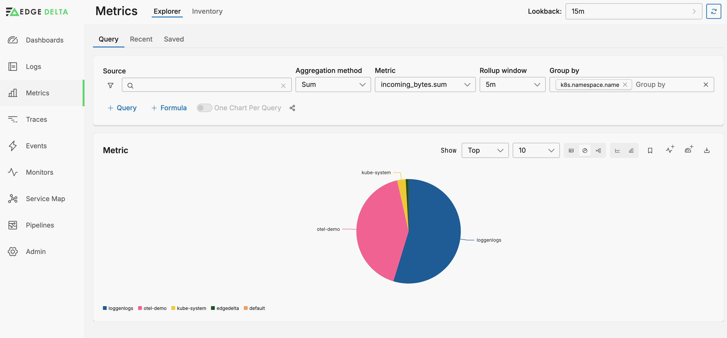
Group by
You can group the graph by any of the facets listed in the Filter Pane using the Group By option. With a group selected you can view the table as a pie chart:
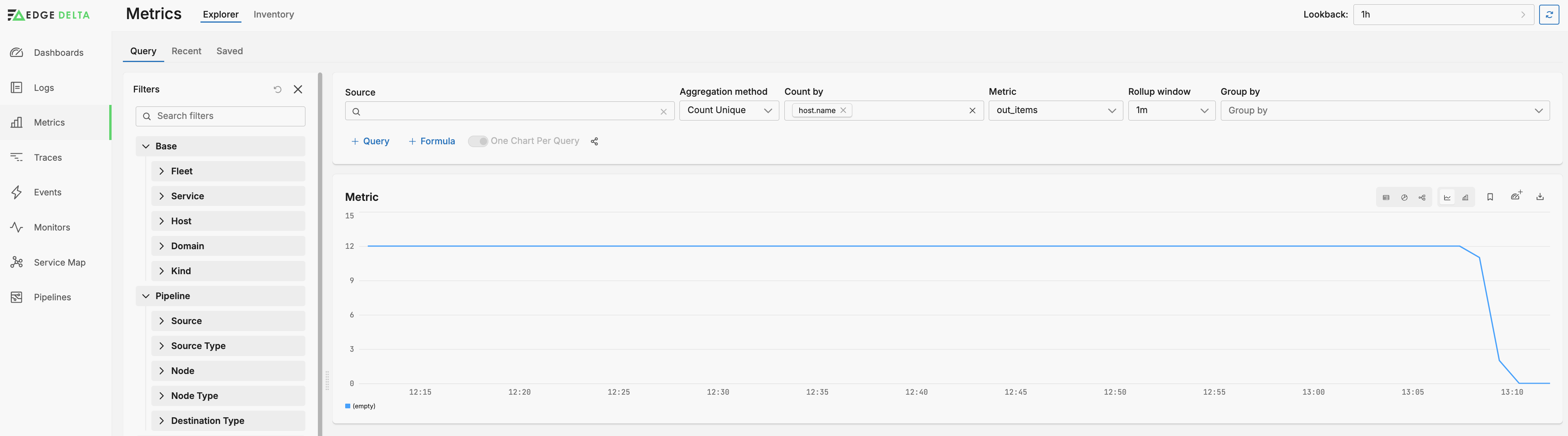
Count By
You can view a count of unique dimension values by selecting Count Unique as the Aggregation Method and by selecting the dimension in the Count by list. For example, 3 hosts have generated an out_items metric in the past 15 minutes.
Add Facet
See Add Facets. For comprehensive guidance on implementing and optimizing facets across all telemetry types, see Effectively Using Facets.
You can select the facet in the Group By list, and you can filter by the facet in the Filters pane.
Create a Monitor
You can create a monitor alert based on the selected filters. Click Create Monitor. Metric Alerts will be available in the Monitors tab in the Edge Delta UI and appear as type metric-alert.
Multiple Queries
Click + Query to add a second query to the metrics explorer. This enables you to view two queries simultaneously for the same lookback period. You can configure additional queries similarly - selecting the source, filters, rollup window and a group. You can choose to view all the queries on a single graph, or you can select one graph per query using the One Chart per Query switch.
In addition, with multiple queries specified, you can add an additional graph configured with mathematical functions executed against the metrics. Click + Formula. The queries are labelled for you and you can use these labels in the formula. For example, you may wish to see the ratio of metrics in query A against the metrics in query B.
If you choose to view all the queries on the same graph you may need to add a multiplier to the function to render it against the existing metrics` Y axis.
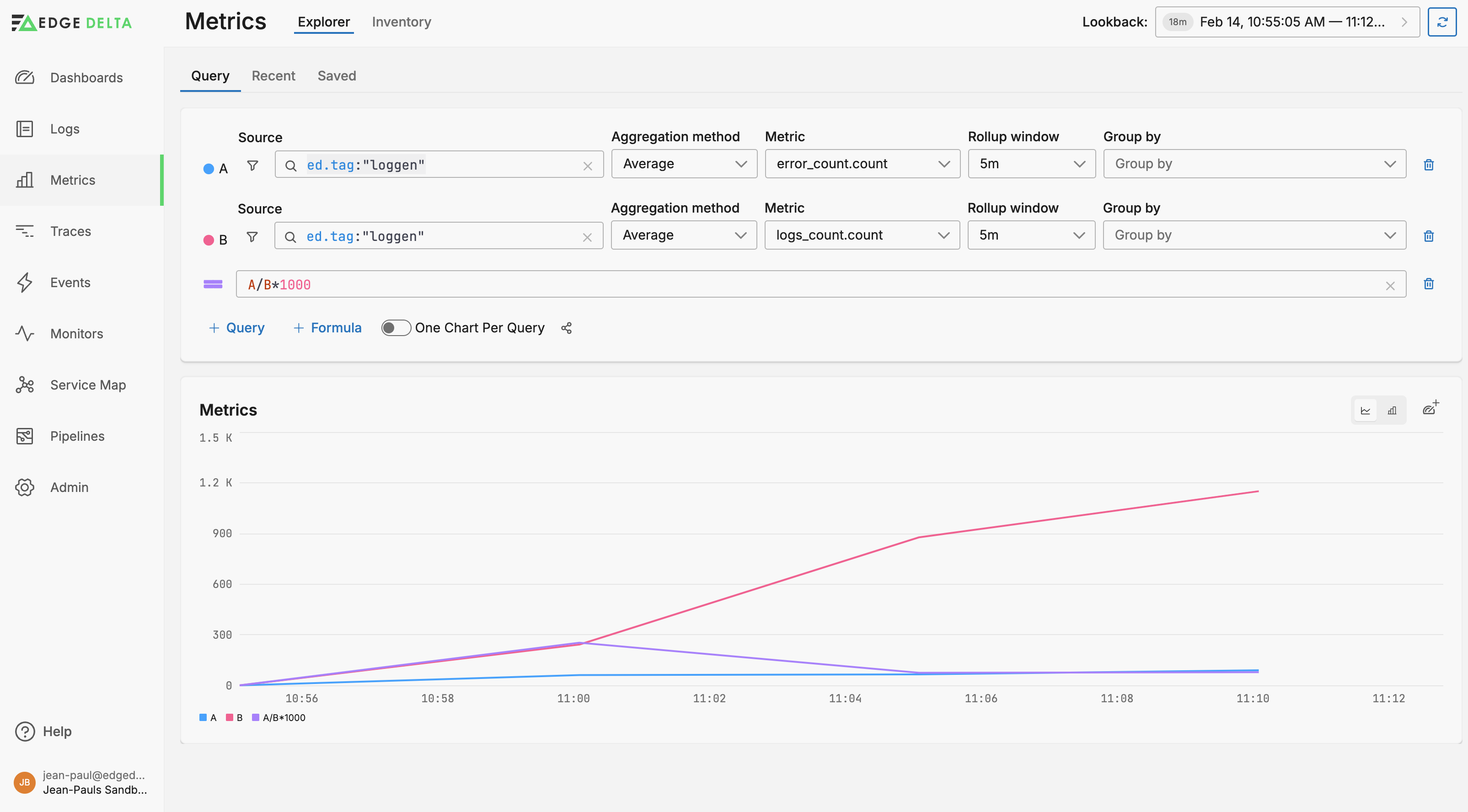
In this example, query A is an error count while query B is a total logs count. They are both configured to show an average of metrics for each 5 minute rollup window period. A function is also specified to show the proportion of errors against the total. A multiplier is added to the function to make the ratio visible when plotted against the 1000+ y-axis value of the total logs count. You can quickly see that the ratio of errors rose up to nearly 30% around 11am before dropping off despite the increase in log volume.